Ritholtz also warns that if the Occupy Wall Street movement isn't careful, it could suffer the same fate as the Tea Party--that is, being co-opted by a partisan political message that over-simplifies and distorts the original themes of the movement for the benefit of an established political party. In the initial stages of a movement or protest, disorganization doesn't really matter, but eventually it does--people (especially those in the media) are always looking for a coherent narrative, and they'll find it wherever they can.
At any rate, in that vein, I was struck by a couple of charts (appropriately enough, all brought to my attention by the very same Barry Ritholtz) that I came across this weekend, and they seemed both related and relevant. I'll leave the conclusions to you.
The first is a series of charts showing the changing distribution of income gains in the U.S. over the past century (culled from this interactive graphic).
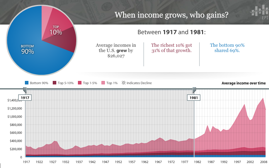 |
| Between 1917 and 1981, the bottom 90% received 69% of income gains. |
 |
| Between 1982 and 2000, the bottom 90% received just 23% of income gains. |
 |
| Since 2001, incomes for the bottom 90% have declined. The top 10% have still gained. |
Related to that is a graphic showing which Presidents were responsible for the majority of our country's debt accumulation. (Note: I always take these "debt by President" charts with a massive grain of salt, because it's always difficult--if not impossible--to properly assess "blame" to one President or another for certain long-standing projects or proposals. If TARP was passed by Bush but enacted under Obama's watch, who bears the brunt of that debt hit? What about tax cuts, and then the extension of those tax cuts? And do we give Obama a free pass for certain of his policies that are certain to create debt in the future, even if they haven't officially done so yet? As a result, the findings of these types of charts have a tendency to be... a bit inconsistent. But they're generally consistent in a range--like, it's indisputable that George W. accumulated significantly more debt than Clinton--if not in specific numbers and percentages. They're far from statistically perfect, and therefore heavily prone to statistical manipulation to suit the artists' needs. But if you appreciate that fact, they can still be interesting.)

Alright, that's it for now. That should at least help explain why so many people are so angry, and why they're out in the streets (that and the fact that they're unemployed and really have nothing better to do). Good times.

No comments:
Post a Comment